Thursday, December 8, 2011

Faith's Bedroom


Before I began this project, Faith's bedroom was empty.  It was painted a peanut beige, but it is a good size room with high ceilings, though, like many kid's rooms, it is a box.  The first thing I wanted to do was paint the room and brighten it. 
I decided on a cream for the top ("Muslin Wrap" by Valspar) and a blue-green (""Sparkling Sage" by Valspar) for the bottom.  My husband installed the chair-rail molding and this made the biggest difference in the room.

Here is the finished room!  The first thing you see when you enter are the fun curtains.  They have every
color that we used throughout the room, so they pull everything together.  The room is contemporary,
fun, unconventional and playful.  

The homeowner, and my friend, picked the duvet, rug and sheer curtains (under the tree ones)
as a starting point.  I liked the checkerboard pattern especially because the carpet we had to
work with has a similar pattern already.  I repeated this pattern in the shadowbox display as well.  There are lots of neutrals in the rug and duvet, but the curtains had a soft avacado, rust, turquoise and mustard
as well as the animal theme.  I RAN with these as inspiration!  They are not typical color combinations, especially for a girl's room, but that is why I think the room is so successful and unique.


Since there is brown in the curtains, I chose to go with a wood frame for the alphabet cards that
spell FAITH (of course).  With all the white it is a nice focal point on this side of the room.  White
would work too, though.  I also like the mix of patterns here: floral bed sheet, gingham duvet, striped
sham and embellished accent pillow.  These elements make the room interesting.
There is a slight, 1 inch difference in the frame height of every other picture; this references the pattern of the shadow boxes on the opposing wall, and keeps it from being too serious.

By now you know I have a thing for making curtains with shower curtains.  When I saw these at Target, I knew they were perfect.  There was even left over fabric for the pillow sham!  Talk about value.  I think layering both sets of curtains absolutely makes the room.

Most of the furniture in the room came from Ikea, which is a great source considering most of it will only be used for a few years, but I added a few antique and vintage finds.  This mirror is vintage and I have had it for a long time but never really had a spot for it in my house.  I knew right away that it belonged in here; I painted it with some left over paint from the shadow box project, and....perfection!

You may recall a post I did months ago entitled "White Elephant."  This is a vintage table
I found at an antiques store that is one of the homeowner's favorite things in the room!  He
is so cute and adds just the right amount of character to the room, while carrying on the
animal theme.  I hate to call it a theme, but I guess I have to!
See!  He can hold books or the sweetest little girl on the planet!
I mean, really, that is just too cute!  By the way,
her talented mom MADE that dress (and Gwenna's
lamb costume for Halloween, too).

A girly little hook to hang her coat or hat on....I had to include
a few very feminine touches, it is a little girl's room after all.


The bench is actually a bookshelf turned on it's side with a custom cushion on top.  It is the perfect storage solution in a child's room, and makes the most of the limited space for seating.

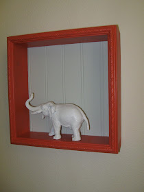
The shadow boxes are my very favorite things in the room.  Probably because I designed
them and my husband built them.  I wanted something unusual that could be changed later. 
They could be painted and/or moved into a different space later when Faith is older.
Soon I will post a DIY on how to make these boxes, but they were simple and inexpensive.  I used the accent colors on the frames and chose to have a beadboard back for interest, painted the same color as below the chair rail.  I also alternated the direction of the beadboard, three horizontal and three vertical.

The animals in the boxes are the Schleict brand, painted white so that they almost look like
little statues. I think my friend Kaley had this idea first!  Don't make my mistake and use
any old spray paint, I found out later that they make one for plastic.

The homeowner did an incredible job on this cushion!


Ceiling fans are usually ugly, but not this one!  We live in the desert
so, like it or not, fans are just a part of life here.

We are still trying to figure out how to make this work.  The homeowner bought this
perfect doorknob at Anthropologie, but the back plate is too small for the existing
hole in the door.  Hmmm, we will have to get creative.
I love the fact that these boxes can be changed out seasonally!  


The perfect little snuggle spot.

Nothing is as cute as that little face, but her room runs a close second! Thank you so much for trusting me and allowing me to decorate this important room; the room that Faith will remember always.  Soon I can share her, soon- to- be- born, baby sister's room!

2 comments:

  1. Wonderful~!!! Your endless ideas and talent made this room so perfect and unique~! And of course, your love toward Faith...^^

    ReplyDelete
  2. Thank you. I do believe that one of the nicest things a person can own is a beautiful space. It really is fulfilling to do that for someone who appreciates it, and to hear that Faith likes sleeping in her new room thrills me. Thanks to you too, for all the painting help!

    ReplyDelete