DGV Nav

Showing posts with label John Saladino. Show all posts

Thursday, January 12, 2012

Lavender, Mauve and Purple


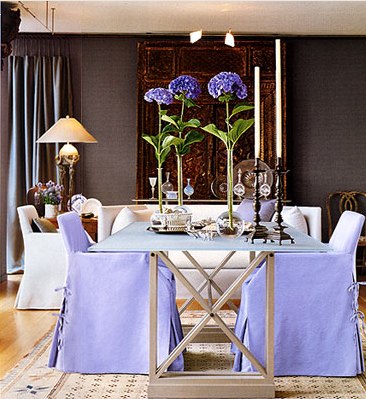
Lovely lavender:  I can almost smell it just looking at this picture.  It is the most striking color and it can go all the way from soft and neutral to intense, and bold.  I love almost all shades and versions of this royal color.


The history of the color mauve. I really want to read this.
This is a color that you love or you hate.  I also think it is easy to do lavender wrong.  Most people associate purple rooms with a version of Barney the dinosaur, and the intensely cloying purple of a tween bedroom.  It is too bad because there are so many shades of lavender that are incredibly easy to live with and that are not too feminine.  I think John Saladino has proven that lavender can be used in a gender neutral way.   Men need to open their minds to the affect of this wonderful color, and forget the gender connotation.


Case in point: Shades of dusky lavender mix well with leather and mohair.


Even in this room with the periwinkle sofa and pillows, it is worldly and rich not gender specific at all.
highglossblue


athoughtfuleye


This is one of my favorite rooms: Saladino uses the most beautiful shade of lavender on the sofa and chair, it is timeless and soft.
Sweet girls room. I adore gingham sheets.
My childhood bedroom was lavender.  I painted it myself and will never forget the calm feel of that room.

Monday, October 31, 2011

Chocolate


Chocolate just sounds better than brown!
November 2011
That is a lot of chocolate for me, but it is beautiful and 
it inspired my outfit.

Nate Burkus room:  I like the white against the chocolate.
Sarah Richardson bathroom:
I prefer brown like this: wood tones as opposed to paint.
John Saladino room:  Okay, maybe I spoke too soon!  This
room is stunning.  I might add, though, that this is a deep chocolate
with lots of grey in it.  

In honor of Halloween and all of the chocolate that will be consumed, I thought I would spotlight this delectable color.  I have to admit that when it comes to decorating, brown is not my favorite color, but hey, taken in small doses, chocolate is healthy right?  I am loving the rusty browns of the season as an accent in my wardrobe and my home, mixed with a few hits of cocoa brown to mix it up.  I also love that blue is lovely with brown and off-sets it's innate warmth (which, for me, can be stifling).  

I always change out the throw pillows in my home for the seasons.  I will
always have white furniture, so I can have fun with color on the pillows.  
I always like blue and green, so my area rug has those colors but there is also
a ground tone of grey-brown as well as a warm brown accent--this makes it possible
to add the warmer colors in the fall.

dress, belt, tights, bow necklace: Forever 21
long necklace: vintage
boots: Giani Bini
purse: Banana Republic

This outfit works for me because there isn't a single
tone of brown throughout:  the goal is not to look like
a baked potato!  The cocoa dress has a dark brown leaf accent
(that relates back to the leather on my belt, boots and purse) 

with turquoise flowers; I then paired it with rust tights.  Gold
jewelry is a must with such beautiful, coppery tones.

Maybe I will be a chocolate convert!  Or maybe I will just continue to love it in small amounts....as I certainly will tonight.

Happy Halloween!

LinkWithin

Related Posts Plugin for WordPress, Blogger...